
The Most Embarrassing Movie Poster Photoshop Fails

Sex and the City 2
As you’d expect, the film’s four creaking leads have been airbrushed to within an inch of their pampered lives in the poster. What we weren’t prepared for, and what’s disturbing us very much indeed, is the fact that Kim Cattral’s got two elbows.

The Hobbit: The Desolation Of Smaug
We like Martin Freeman for his everyman charm, not this waxwork-esque face fronting the latest promos for Peter Jackson’s Tolkien trilogy. Fans quickly spotted the gaffe: One online commenter asking: “Who knew Middle earth had plastic surgeons?”

Anomaly
Something is seriously off with the perspective in this picture. Either Noel Clarke has tiny hands or a ginormous head, but either way it gives the impression that he’s a tiny child brandishing a gun. Very odd.
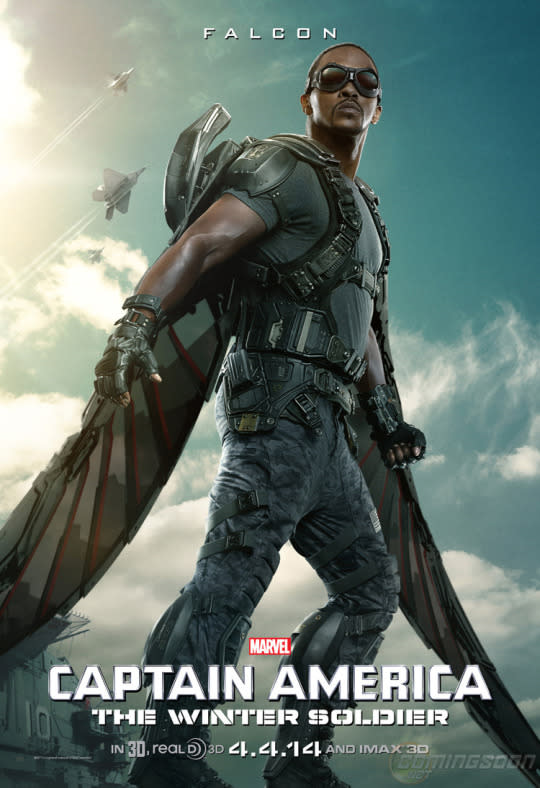
Captain America: The Winter Soldier
Looks like Anthony Mackie’s been missing “Leg day” at the gym… Marvel’s latest poster for the ‘Cap’ sequel photoshopped the actor’s bulked-up torso onto a hilariously slimmed-down lower half. Fans immediately spotted the gaffe, and within hours the internet had made up its mind: those definitely aren’t his legs.
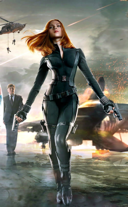
Captain America: The Winter Soldier (Again)
Scarlett Johansson’s waistline became the subject of more online outrage when fans spotted the star was looking bizarrely Barbie-esque on the new Marvel poster. “You know there is no helping the world when even Scarlett-Joh’s already little waist is shopped,“ summed up one fan.

Heartbreakers
Ageism strikes again in this needlessly creepy poster for ‘Heartbreakers’, making a then 52-year-old Sigourney Weaver look distinctly younger. Also the photobombing Gene Hackman. That’s not his arm, is it?

Bad Lieutenant
Aside from the lack of lizards - so vital to Werner Herzog’s barmy remake - this is a nice-looking poster… perhaps too nice. Eva Mendes’s chest has been significantly, umm, enhanced via the magic of Photoshop. The results are unconvincing and probably a bit offensive.
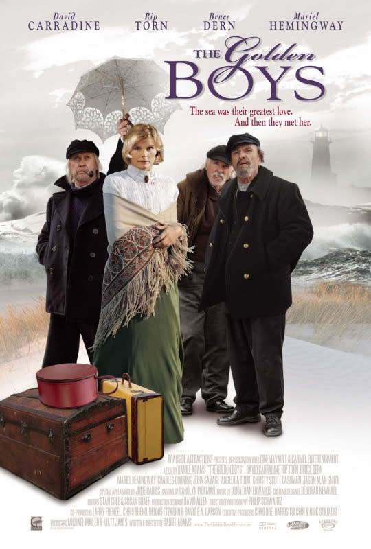
The Golden Boys
This forgotten and apparently terrible romantic comedy got an equally awful poster. Besides the duff tagline: ‘The sea was their greatest love: and then they met her’, the glaring mistake here is the dismembered arm holding up the umbrella over Muriel Hemingway. There’s no way it belongs to David Carradine.
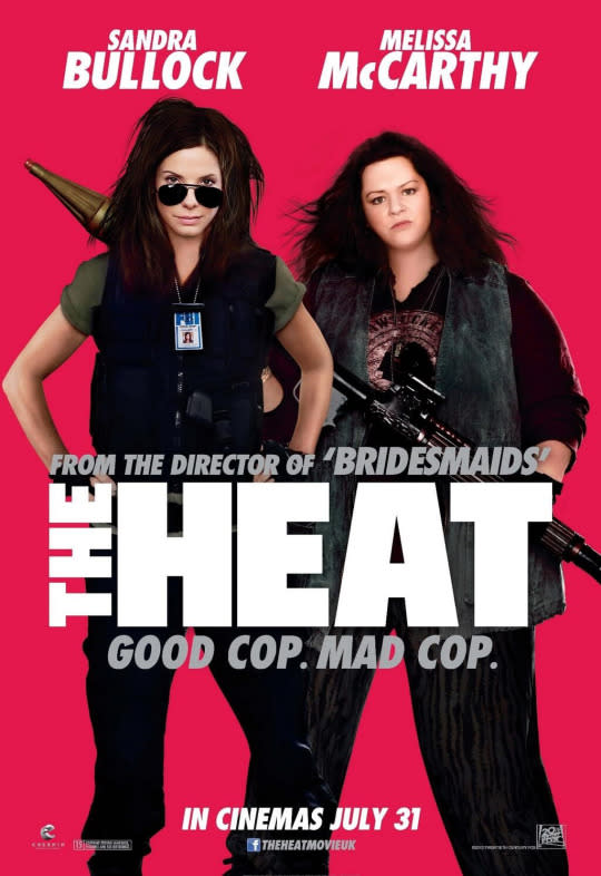
The Heat
Plus-sized and proud actress Melissa McCarthy became the victim of Hollywood’s slimming eyes when the UK poster for Sandra Bullock co-starrer ‘The Heat’ knocked a good 30lbs off the ‘Bridesmaids’ star’s face. Has that neck and head ever actually met?

The Accidental Husband
Firstly, Jeffrey Dean Morgan and Colin Firth aren’t even looking at the falling Uma Thurman. Much more worrying though are Firth’s hands - they’re freakishly big compared to the rest of his suspiciously puny body.

Bangkok Dangerous
Nicolas Cage’s hair isn’t the only thing that’s fake on this poster. Check out his arms; one is disappearing into the side of his leather jacket, while the other, seemingly holding a gun, is emerging from a weird, unnatural angle. In fact, wait a minute; he’s not even holding a gun at all! Who knows what’s going on here.
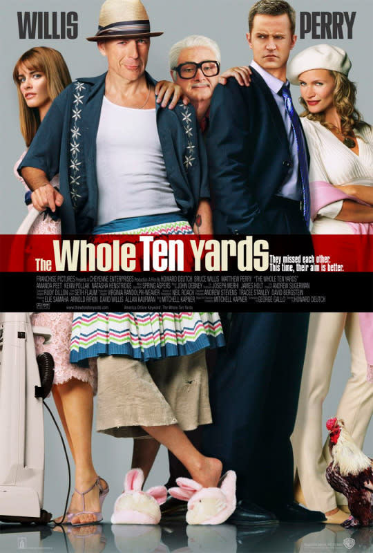
The Whole Ten Yards
A classic bad poster here - everything about it’s just not quite right. A few lowlights: Bruce Willis’ weirdly taut face and spindly ankles; Mathew Perry’s head - which is too small for his body - and worst of all; Kevin Pollack’s creepy dismembered hands that we’re fairly sure don’t belong to the actor. Also, what’s with the chicken?

Street Kings
Most people need a finger to pull the trigger of a gun. Not Keanu Reeves. The ‘Matrix’ star manages to shoot with only the power of his mind in this missing-digit poster for ‘Street Kings’.

Life As We Know It
Katherine Heigl and Josh Duhamel not only have a messy living room, they seem to own a creepy cardboard cut-out of a child in this badly made poster for below-par rom-com ‘Life As We Know It’.
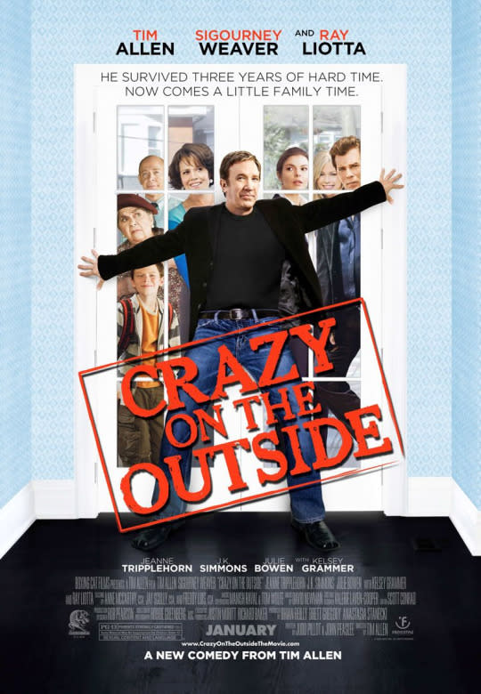
Crazy On The Outside
Exhibit a) the cut-out-looking characters behind the door – each with their own light source. Exhibits b) to z) Tim Allen. Check out the pasted-on head, optimistically buff body and oddly short arms. As if selling a Tim Allen movie wasn’t tough enough already.

King Arthur
Keira Knightley hit out at the folks behind the poster for 2004’s ‘King Arthur’ when the designers clearly “penciled in” her breasts. “They gave me these really strange droopy t*ts,” the actress told Allure. “A: I don’t have t*ts anyway, and B: they digitally made them, and I thought ‘Whoaaa!’”
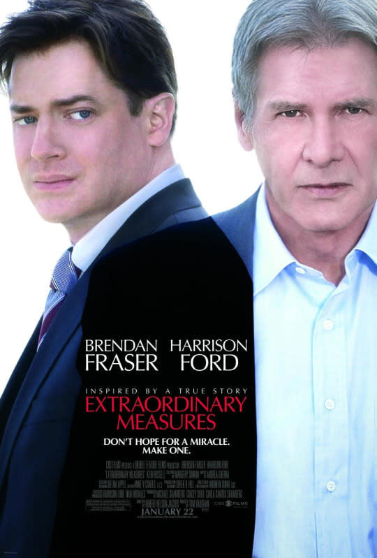
Extraordinary Measures
Being an utterly boring poster that tells you nothing about the film isn’t actually the main crime here. Have a look at where Harrison Ford and Brendan Fraser’s shoulders meet. Should they really be overlapping like that? Umm, no, obviously.

Grudge Match
It’s not uncommon for posters to feature the ol’ “head transplant” technique, especially when older stars need a better toned bod (see Sly Stallone, on the left). Only an over-zealous designer seems to have given Robert De Niro the full treatment, tampering with his head too. Just weird.

Blonde And Blonder
Aside from the fact that Pammy and Denise appear to be giants, towering over their own car, the most suspect thing in this poster for ‘Dumber & Dumber’ inspired ‘Blonde And Blonder’ is Pammy’s clearly plastered-on head. And what’s wrong with her wonky knee?

My Best Friend’s Girl
Another classic here that was so bad even the star slated it. Dane Cook (in the middle) took to his blog to compile a ten point list of mistakes. Criticisms included: "the left side of my face seems to be melting off of my skull”, his “perfect porcelain flesh” and a stare that looks like his character has “fallen in love with a strand of Kate Hudson’s hair”.
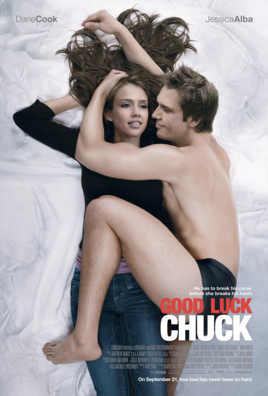
Good Luck Chuck
Poor Dane doesn’t have much luck with posters as he features in another shocker here. Supposedly referencing the iconic cover of Rolling Stone, which saw a nude john Lennon curling up with Yoko Ono, Cook looks more like some kind of alien parasite preparing to infect a blissfully vacant Jessica Alba. Unnatural and genuinely creepy.
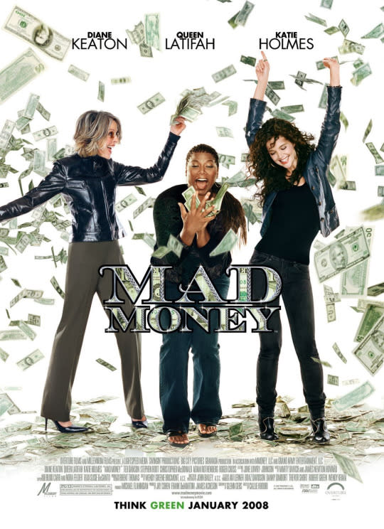
Mad Money
Queen Latifah and Katie Holmes are okay, but look at Diane Keaton on the left. Her head is enormous, her right leg is at a horribly unnatural angle and her right arm is weirdly slender. Not good.

Wanted
A pretty cool poster here featuring lovely Ange, but take a closer look at the arm holding the gun. Either Mrs. Pitt really needs to start eating more, or the freakishly long/thin arm and hand don’t match up. Wanted: a new designer.

The Penthouse
A grab bag of amateurish Photoshop here. Each head rests unconvincingly on unconnected bodies; the bed appears to be hovering on a wooden floor; Kaley Cuoco’s feet (second-from-right) were surely taken from a photo of someone standing up, and so on. Proves putting a drop shadow on something doesn’t necessarily make it look convincing.
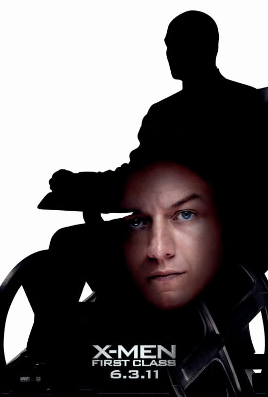
X-Men: First Class
“Hey, how about we have a silhouette of Professor X and James McAvoy’s face so people know this is a prequel but the characters are the same!” At some point in time somebody (a paid somebody) pitched this idea for a poster. It’s not necessarily a bad idea but the execution couldn’t have possibly been worse. Just look at McAvoy’s face! This is lazy in the extreme.

Legion
Let’s scan down from the top. Decent font to make the title stand out, Paul Bettany as an angel, this is quite good actua…. OH GOD THAT GUN! Could that sub-machine gun look any more fake? It’s like somebody cut it out from a Texan Argos catalogue and stuck it onto his left hand with blu tac.

Spider-Man 2
On the surface this looks fine, it’s stark and memorable showcasing the beautiful damsel in distress, the action (tears in the suit), the villain reflected in Spidey’s eye and the city of New York in the background. Unfortunately it also looks like Kirsten Dunst’s arm should be about two metres long to be able to put her hand on his shoulder like that. These professional designer folk have trouble with arms apparently.

Nothing To Lose
Tim Robbins is a lofty 6’ 5’’, Martin Lawrence is a compact 5’ 7’’. Only this overly airbrushed ‘Nothing To Lose’ poster makes Lawrence look more like Robbin’s man-child son.

