
Miguel Reyes Breathes New Life Into Type Design
This profile is part of our series “Quiénes Somos,” which focuses on nine amazing and original creators in the Latinx community. You can read more by visiting our Latinx Heritage Month homepage.
By Yenwei Liu
Miguel Reyes, originally from Puebla, Mexico, studied graphic design at Benemérita Universidad Autónoma de Puebla before working as a type designer, graphic artist and publication designer in Mexico City and Barcelona. He later studied type design at the Centro de Estudios Gestalt in Veracruz, Mexico, and attended the Type and Media master’s course at KABK in The Hague, Netherlands. He began working with Commercial Type, a digital type foundry, in 2013. His work has been honored by the New York Type Directors Club, the Latin American Typography Biennial, and the Fine Press Book Association.
Howwouldyou describe what you do to someone who’s not involved in the vicinity industries? How do non-design people respond when you tell them you’re a type designer?
Normally they don’t know what a type designer does, but I often ask if they know a specific typeface like Times New Roman, Arial or Comic Sans. And normally everyone responds that they know them, so I explain that I’m someone who designs similar stuff that they can use and type on their computer. And from there, if they are more interested, I explain how we do this for brands, newspapers, magazines, etc. To help them to express their own voices.
You were trained as a graphic designer in the beginning. There are so many career paths for practicing graphic design — branding, image-making, advertising, editorial. How did you come to focus a design career on type design?
Type to me is the main tool for graphic designers. I think 80% of graphic design is done with the use of type, and my first jobs where I focused on editorial designs. So I started to work more closely with type, and I started to wonder how typefaces were done and who was designing them. And that’s more or less how I ended up studying type.
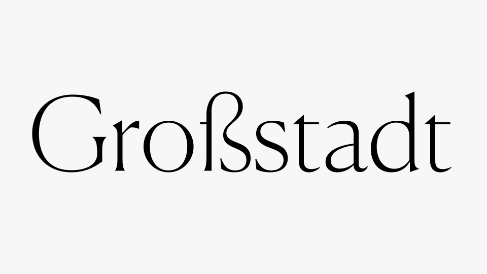
Canela Type Specimen
Courtesy of Miguel Reyes
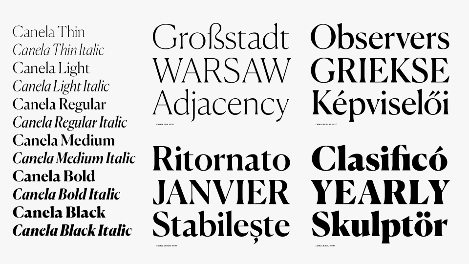
Canela Type Specimen
Courtesy of Miguel Reyes
What are some of your favorite type designs? Why is type design important?
I like many typefaces, but some of my all-time favorites are Caslon Old Style by William Caslon the First, Lexicon by Bram de Does, and Centaur by Bruce Rogers just to name a few. They have inspired some of my work, but also they are more contemporary typefaces that I love.
You mentioned your practice involves both type designs and lettering design for wordmarks [logos for brands like W Magazine]. What is the difference between type design and logo lettering?
When you design a typeface, you are designing a system. It is something like putting together puzzle pieces, you need to design every letter thinking that every one of them will appear in combination with the rest of the letters in any possible word combination. Each glyph in a typeface is contextual to one another, whereas designing lettering and workmarks is a bit easier in some way, because the combination of them only appears in this specific scenario. So you don’t need to worry about the uses of letters outside of the wordmark since they won’t appear somewhere else. In this case, you can take more liberties.
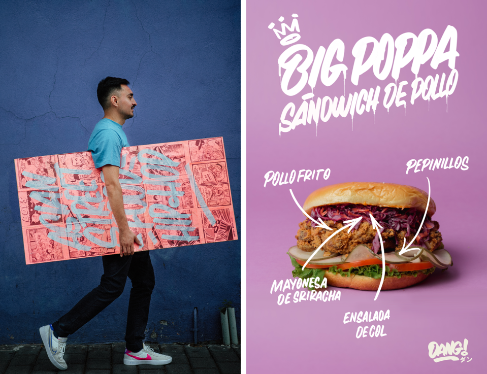
Lettering design for Dang Noodles
Courtesy of Miguel Reyes
What are some of the types of design work you’ve done? And who are the clients?
Since I’ve been a professional type designer, I’ve been part of Commercial Type, an international type foundry based in New York City. We work for many different companies — two of my solo typefaces are Canela and Ayer, but I’ve done many others for different clients like W Magazine, Yandex, La Repubblica newspaper in Italy, McClatchy Company, NBA, NFL Network, The Atlantic, New York Magazine, Time Magazine, Quora, and my typefaces are in use by many other brands.
Canela & Ayer are now being widely used by designers. Would you talk more about these two typeface projects? Why do these projects resonate with you in particular?
Canela started as a personal project. I was fascinated with Caslon Old Style for many years, and I wanted to do something inspired by it. The main idea was to do my own interpretation on it and to make something that is inspired by history, and make it into something utilitarian and contemporary-looking at the same time. The whole project took me around three years.
Ayer started out as a typeface designed for W Magazine, and it’s a project completely different than other ones. Its specific nature ended up with a really interesting outcome. They were looking for a new type for fashion editorial design, but they did not want to go down the beaten path of using the off-the-shelf, high-contrast modern serif typefaces like Didone or Baskerville that are widely used for fashion publications. They were looking for something quirky and at the same time pretty but different from other fashion editorial publications. Also working directly with the creative director and art director helped a lot in shaping the design of the final typeface because we were exchanging different ideas at the beginning. They did not ask for italics. But funny, we ended up designing four different italics; the whole project took around two years to be complete.
You mentioned some personal lettering work you do (supermarket flyers etc.) reminds you of childhood in Mexico. What are some of these lettering works? Would you talk a bit more about it?
I’ve always been passionate about vernacular sign painting here in Mexico and later for the same in other parts of the world. On my personal stuff I’ve always wanted to incorporate these influences, and I’ve been able to do some of the clients’ work with these characteristics. What I love about these is their inherent quality of being done by hand, something of imperfection and quirkiness.
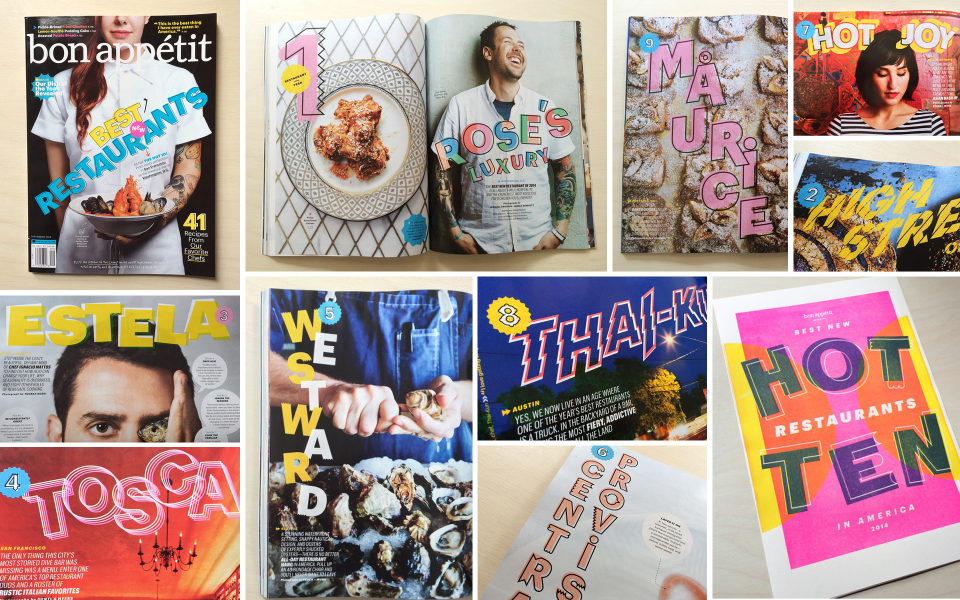
Lettering designs for Bon Appétit
Courtesy of Miguel Reyes
As a Mexican designer educated in the Netherlands who has worked in the U.S., how do you feel your identity, cultural background and education play into your work?
I think I’m a mix of all the places where I’ve been able to live, study and work. It’s really difficult not to incorporate all the influences from wherever I’ve been. To me, it is really difficult to say now my work just looks Latino because I’ve lived and worked in the U.S. where my design visions were given chances to realize. Every project is unique in its own way, and as a designer, I respond to the visions and the needs for each project, and I don’t necessarily feel compelled to add my signature to them. I’m proud of being Latino and Mexican, but I understand that what I do for a living is to develop a design tool for global use, and the necessities or qualities for the use of typefaces are completely different from case to case. So I’m always trying to adapt my work for what is needed.
What are you working on now?
I’m working on a couple of type design projects that will be available for purchase through the Commercial Type catalog. I’m also finishing up a typeface that we designed a few years ago for an Italian newspaper, La Repubblica, which we will soon release in our catalog as well. The other two are personal projects, one is a blackletter that started from Canela and the second one the idea is still in the works.
This interview has been edited for clarity and length.

