
People think Instagram updated its logo, and they hate it
People think Instagram made its logo obnoxiously brighter.
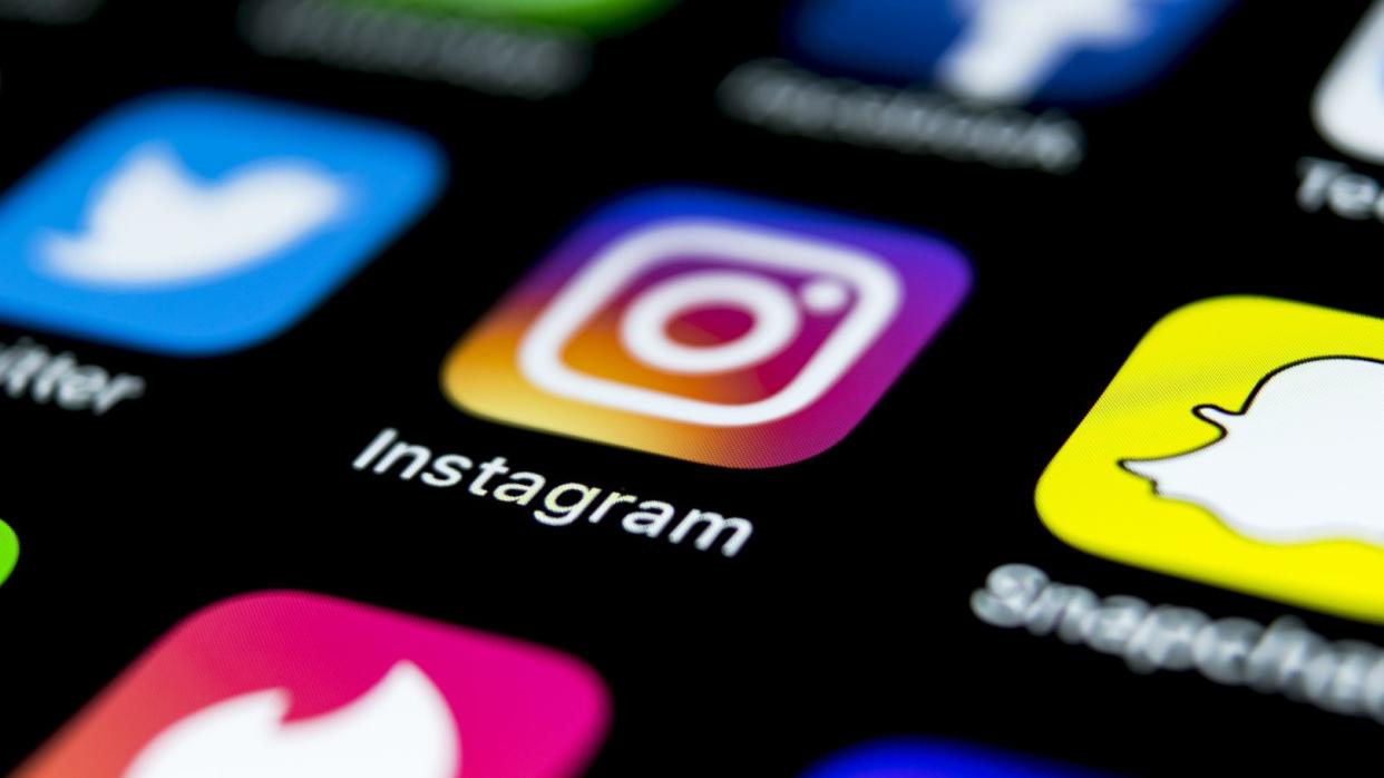
You may have noticed that your Instagram icon has been updated. While the design and colors are the same, people on social media are complaining that it’s now oversaturated. It’s apparently as if someone at Meta turned the brightness up on your screen by 1,000%.
Since 2010, Instagram has had four different logos with a camera motif. The last time it spruced up the design was in 2016, when it went from the old brown camera to the flat colorful gradient.
did the instagram logo change colours a little bit or am i crazy
— walmart elsa (@willohw) May 18, 2022
“Did the Instagram logo change colors a little bit, or am I crazy?” @willohw wondered on Twitter.
#Instagram just changed its logo pic.twitter.com/pMVcdo2eU5
— Hammod Oh (@hammodoh1) May 16, 2022
The user @hammodoh1 shared a side-by-side of the old and new logo in a tweet.
Have to reduce my screen brightness for that. 🫣
— bilal (@bilalkhettab) May 16, 2022
“Have to reduce my screen brightness for that,” @bilalkhettab said of the new update.
ik im not tripping but Instagram changed their logo, it's more bright the colors and the ring on stories has a new color i just noticed right now? pic.twitter.com/FOU52jIqts
— Haroun Ramadan 🇵🇸 #SlavaUkraini🇺🇦 (@abu__george) May 17, 2022
“I know I’m not tripping, but Instagram changed the logo. It’s more bright, the colors, and the ring on Stories has a new color. I just noticed right now,” @abu__george wrote on Twitter.
gonna take a while to get used to Instagram’s new app icon
saw this on IG for Android a while ago and thought something’s wrong with my phone’s display or that I’m going crazy 😛 pic.twitter.com/T7w3bVsK9z— Jane Manchun Wong (@wongmjane) May 16, 2022
“Gonna take a while to get used to Instagram’s new app icon,” @wongmjane said in a tweet. “Saw this on IG for Android a while ago and thought something [was] wrong with my phone’s display or that I was going crazy.”
The post People think Instagram updated its logo, and they hate it appeared first on In The Know.
More from In The Know:
Amazon shoppers convinced me to buy these super comfortable leggings that are on sale for $21
5 of the best drugstore face serums that shoppers love
Nordstrom is having a huge sale on my favorite under-the-radar brand: Shop ASTR the Label

