
Tokyo Olympics logo designer says plagiarism claims 'baseless'
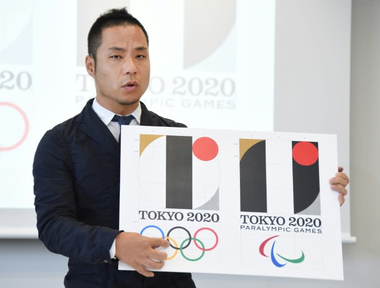
The designer of Tokyo's logo for the 2020 Olympics said Wednesday he was shocked at "completely baseless" plagiarism allegations, and supplied details of his work to prove his good faith. The comments by Japanese artist Kenjiro Sano marked his first public appearance since the logo drew threats of possible legal action in Europe last week. Sano said he rushed back to the Japanese capital from New York City to rebut, in person, claims that he stole key elements of a Belgian theatre company's emblem. "I'm very surprised. This is completely baseless," Sano told reporters. "I've never been to Belgium, and I've never (previously) seen the logo" designed by Olivier Debie for a theatre in the Belgian city of Liege, he added. Debie's lawyer said he has sent a formal letter of complaint to the International Olympic Committee, which on Saturday denied there was a problem and said that the theatre did not have copyright protection. The logo controversy came as Japanese officials were still smarting from the fiasco over the Olympic stadium several weeks ago, when Prime Minister Shinzo Abe ordered plans to be torn up amid growing anger over its $2.0 billion price tag. Tokyo's logo is based around the letter "T" -- for Tokyo, tomorrow and team with a red circle representing a beating heart. The theatre's logo features a similar shape in white against a black background. But Sano said Debie's work "is probably made of T and L for Liege, while mine is made of a square that breaks up into nine parts". The Japanese designer acknowledged some similarities between the works, but said he poured everything he had into creating an original design. "I worked on this with great passion... and I'm convinced this is a piece that has no parallel in the world," he said. Sano added that he drew inspiration from the 1964 Tokyo games, as he presented reporters with diagrams to show how he arrived at the final design. "I thought I could bring something that inspires a huge hinomaru (the rising sun on Japan's national flag) used in the 1964 Tokyo Olypmics," Sano said. Hidetoshi Maki, head of marketing for the 2020 Olympics organising committee, said that despite the legal dispute "no concerns have been raised by our sponsors". To add insult to injury for Tokyo, subsequent claims emerged that the emblem also bore remarkable similarities to a design by Barcelona-based firm Hey Studio created in support of Japan, following the deadly tsunami in 2011. Asked about the apparent resemblance, Sano said: "I think the colour of red, silver and gold are of Japanese rather than Spanish origin."
