
‘A Gentleman in Moscow’: Why Abstract Russian Art Came to Dominate Its Main Titles
When the 2016 Amor Towles novel “A Gentleman in Moscow” was published by Penguin, designer Melissa Four was given a list of specific elements to use on the cover of the book that stretches from the Russian Revolution into the 1950s: a woman, a cocktail glass, a clock, a piano, a key …
But when that book was turned into an Apple TV+ limited series starring Ewan McGregor as a count sentenced to lifetime house arrest in a luxury Moscow hotel, title designer Matt Curtis got an entirely different assignment.
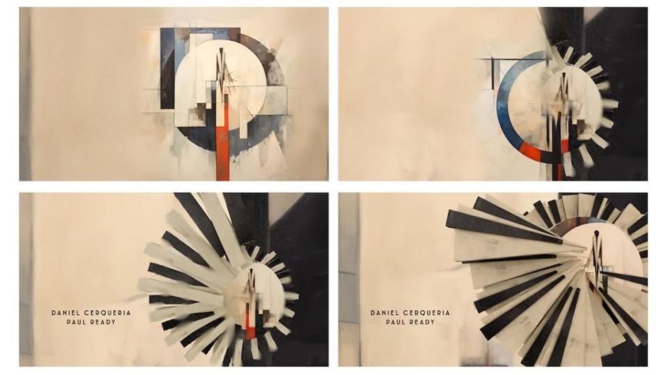
“Basically, the brief was to do something that was in contrast to the show, but in keeping with the time and period,” said Curtis, who came up with an arresting sequence that is abstract rather than figurative, with a nod to Russian artists like Wassily Kandinsky.
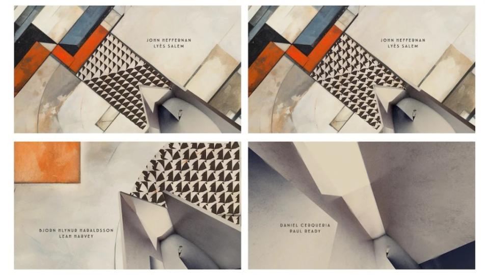
“We discussed with the producers whether we wanted to have imagery from the show, which was an immediate no. It was the idea of contrast that gave us the idea of the avant garde, Art Deco Cubism of that period. It seemed to be quite rebellious in its own way because it was totally against the thinking of the revolution. I don’t know how they managed to get away with some of it, but for a good 10 years they made art that seemed to oppose the new regime. And what was lovely is that the work was really bright and colorful as well.”
His initial take on the sequence incorporated a bit more narrative: a floor would turn into a staircase, a piano would appear. “But we took everything out and brought it to the bare bones, which was the best way to go,” he said. “And once we realized that, it sort of flew together.”
Still, there is some figuration as the abstract drawings increase in complexity. “There are basically three elements to it,” Curtis said. “There’s the Count, who is not featured heavily. At first, he’s just a blob. It’s about his imprisonment, so the walls are growing around him. And there’s the passing of time, so there’s lots of movement—circles and things and shadows against the wall.”
Curtis said his company did about three variations in their initial storyboards, but quickly zeroed in on one of those. “There were just tiny tweaks along the way,” he said. “It was a joy of a job, I have to say, because it was so different and such fun to do.”
Curtis is a British graphic designer who began his career designing record sleeves but now specializes in title sequences, including the recent films “Civil War,” “Wonka” and “Napoleon.” He’s seen periods when the emphasis is on bland, strictly informative titles, but said that this is not one of those periods, given the attention that has been paid to title sequences for shows like “Game of Thrones” “Stranger Things” and “Severance,” all of which won Emmys.
“We’ve worked on a lot of great title sequences, but there were also a lot that just wanted text,” he said. “But the streamers, over the last four or five years, have upped the game again.”
This story first appeared in the Limited Series issue of TheWrap’s awards magazine. Read more from the issue here.
The post ‘A Gentleman in Moscow’: Why Abstract Russian Art Came to Dominate Its Main Titles appeared first on TheWrap.

