
Saskatchewan Roughriders unveil new alternate uniform and logo
The Saskatchewan Roughriders will be sporting a new look for two home games this season.
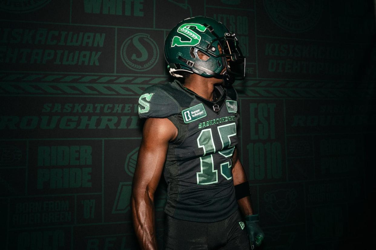
The Riders introduced a new dark, obsidian green alternate uniform and logo on Thursday.
The new uniforms will be worn on July 19 against the Winnipeg Blue Bombers and on October 26 against the Calgary Stampeders.
Roughriders president and CEO Craig Reynolds said the team was excited to unveil the alternate uniforms and logo after several years of planning and perfecting them.
"Both were created with Rider Nation in mind and inspired by the province of Saskatchewan, pulling colours from our team, our landscape and our skies," Reynolds said in a news release.
"We hope our fans will wear the alternate jersey and logo with pride, as we will, alongside the retro, home and away jerseys we all know and love."

The Roughrider's president says the team was excited to unveil the new alternate uniforms after years of planning. (Submitted by the Saskatchewan Roughriders)
The Roughriders said the obsidian green, which is found in the outline of the logo and is the primary colour on the alternative uniforms, is meant to embody a toughness found in the shadows.
The Rider green found in the bottom part of the S in the new logo is meant to represent the tenacity that people from Saskatchewan have.
The emerald green found in the top part of S in the new logo is reflective of the fireworks above Mosaic Stadium and the northern lights that glow above Saskatchewan, the Roughriders said.
The wheat spike found in the middle of the S logo is a symbol of Saskatchewan and its people. The spike is topped by a 13th kernel, paying homage to the 13th man and the Riders "incredible" fan base.
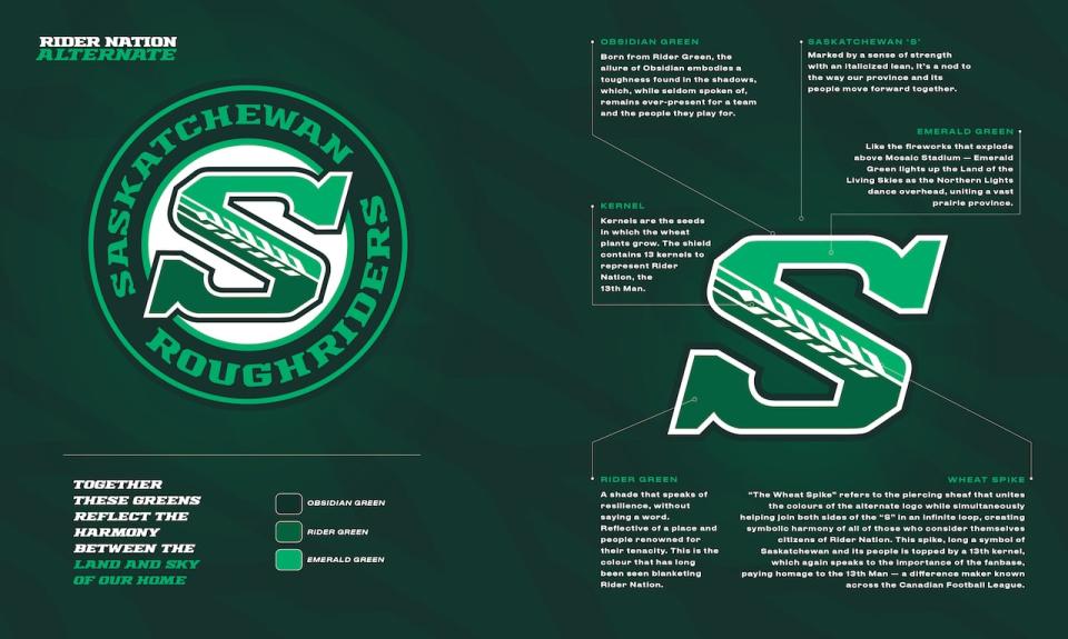
Explainer of the Rider's alternate logo and uniforms. (Submitted by the Saskatchewan Roughriders)

